[Case study] Kohde internal research and development
Designing a cloud platform from the API documentation up
- Cloud provisioning platform
- Internal, not released
- 2026
NEO is a self-service cloud provisioning platform built on OpenStack, designed for a telecom operator to resell infrastructure to its own business customers. There was no existing product to improve and no users to interview. What there was, was documentation.
- Client
- Kohde internal research and development, aimed at NEC XON
- My role
- Designer, domain research to wired prototype
- Timeline
- 2026
- Status
- Sales prototype, not released
Context
A cloud management platform sits between an operator's infrastructure and the businesses buying capacity on it. NEO models that as two tiers. Hosts are the operator's direct customers, and tenants are the customers of those hosts. Underneath, the platform talks to OpenStack, so every screen has to correspond to something the API can actually do.
The work was internal, aimed at a platform Kohde could take to market, which changed the shape of the problem. Nobody was going to tell me what the screens should contain, and there was no legacy interface to inherit assumptions from.
The problem
OpenStack returns raw values. RAM comes back in megabytes, image sizes in bytes, power state as an integer where one means running and four means shut down. Usage arrives as cumulative hours from one service while live utilisation comes from another entirely.
The interface is where a set of API responses has to become a picture of infrastructure that a cloud admin can act on without translating anything in their head.
There were two easy mistakes to make here. One was showing everything the API returns, which gives you a console instead of a product. The other was hiding the mechanics so far behind an abstraction that an engineer stops trusting what is on screen.
Learning the domain before drawing anything
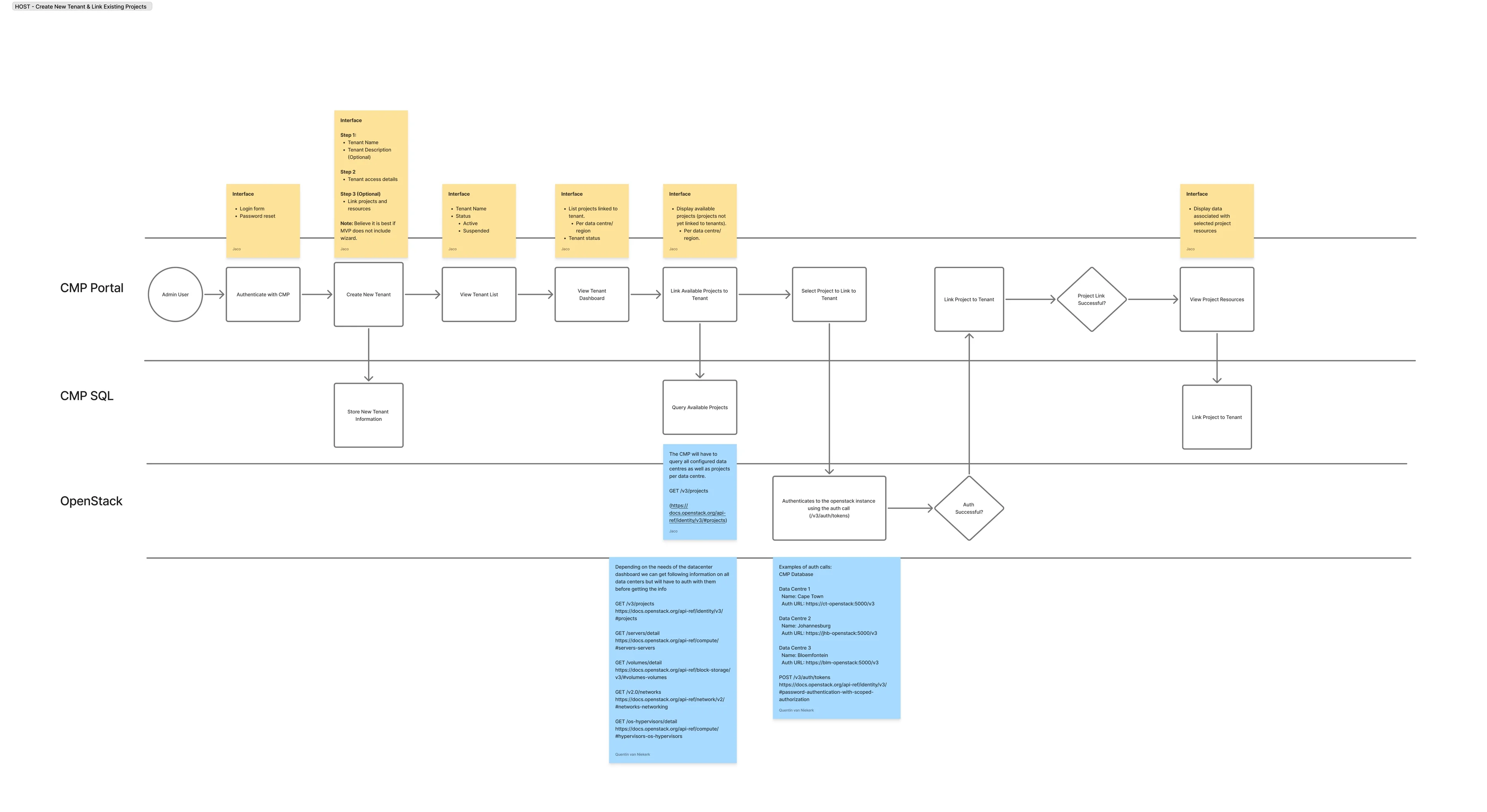
I worked through the OpenStack and CloudStack API documentation and mapped what each service could give me: Keystone for authentication and projects, Nova for instances, flavours and usage, Cinder for volumes, Neutron for networks, Glance for images, Gnocchi for utilisation metrics. Cloud provisioning practice filled in the rest, particularly around quotas, regions and how tenants are separated.
That work turned into flows that carry the endpoints alongside the screens, so the interface and the integration were argued about in the same artefact rather than in two separate conversations.
Low fidelity
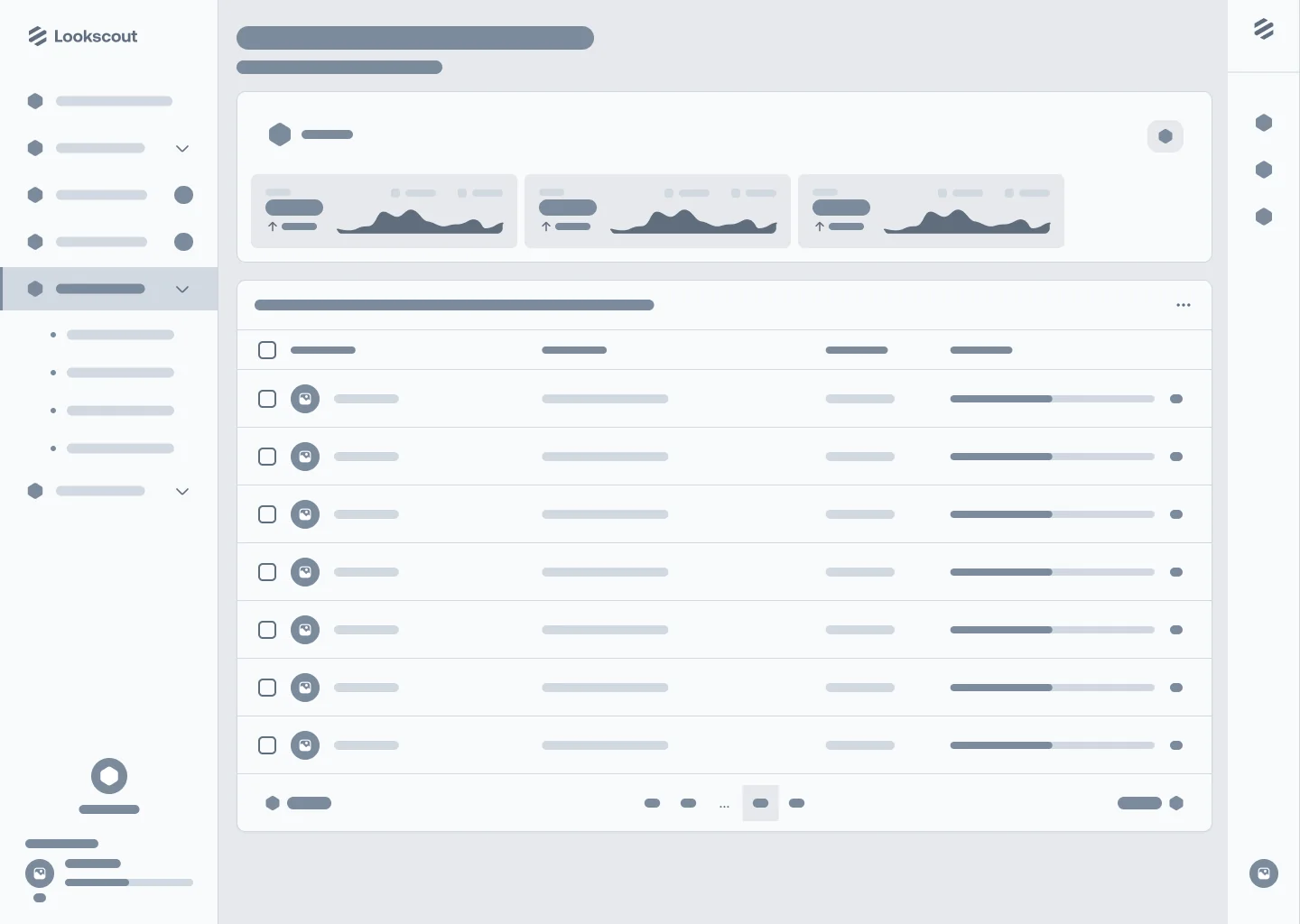
The wireframes settled the hierarchy. NEO drills through four levels, from datacentres to projects to resources to a single resource, and that order never blends. A virtual machine always belongs to a project, which always belongs to a datacentre, because that is how the infrastructure is actually partitioned and any shortcut across it would produce a screen the API cannot honour.


High fidelity
Reading the dashboard
Decisions
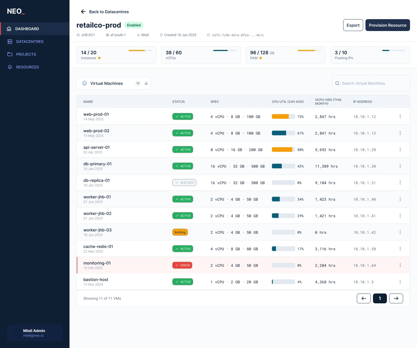
- Utilisation and usage are never mixed. Live percentage from Gnocchi and cumulative hours from Nova answer different questions, one about health and one about billing, so they sit in separate columns and never share an axis.
- Quotas shown as fractions. Fourteen of twenty instances tells an admin how many more they can start. Seventy percent does not.
- Status carries a label as well as a colour. Active, shutoff, building and error each carry a label, since an operator reading a table of eleven machines should not have to decode a palette.
- Monospaced numerics. IP addresses, hours and identifiers are set in a monospaced face so columns of figures line up and a mistyped address is visible.
Resource detail
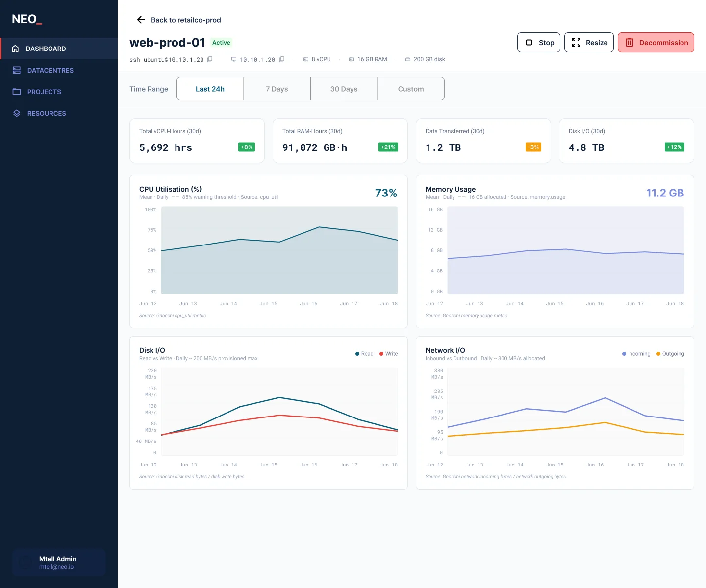
Decisions on the resource screen
Decisions
- Every chart names its source. Citing the metric beneath each chart means an engineer can check the number against the API rather than taking the interface at its word.
- Decommission is treated differently from the rest. It is the only irreversible action, so it carries the only destructive treatment while Stop and Resize stay neutral.
- Actions follow machine state. Start and stop are enabled by the instance's power state rather than always offered, so the interface cannot invite an action the API will refuse.
- Demo data that looks like the market. South African business names, a realistic naming convention of environment, purpose and number, and IP ranges that hold together, because a sales prototype full of Lorem Ipsum invites questions about the product rather than the capability.
Outcome
- 6 servicesOpenStack services mapped to screens: Keystone, Nova, Cinder, Neutron, Glance, Gnocchi
- 44+Wired connections in the clickable prototype
- 4 levelsDatacentre to project to resource to detail, held consistently
NEO has not been released. It exists as a wired prototype used to demonstrate the concept, with a design system, screen specifications and API mappings documented behind it so a build could start from the artefact rather than from a conversation.
Reflection
If I could go back, the thing I would change is the research. A lot came up in a debrief with one of the technical guys afterwards that would have given the tables more structure, and much of what sits in the table could have moved to the detail screen instead. That would have been simpler, particularly since we are dealing with live information. This was a sales prototype, so it was meant to look impressive, but it was also meant to guide a real implementation of the platform. I should have taken a more measured approach between what is realistic and what is daydreaming.